Is your email signup form creating a confusing situation?
 There is perhaps no dirtier word in web design than “confusing”.
If you have a website, “confusing” is your evil nemesis. Visitors will always choose to leave a confusing web page in favor of one of the many non-confusing web pages out there. Also, they won’t come back to see if you’ve fixed the situation.
But you know this. So let’s discuss how it relates to email opt-ins.
We are living in the golden age of mailing list sign-up forms. Or, as they are also known, email opt-ins. Or, in even plainer English, the place on a website where email addresses are gathered so everyone can keep in touch. Unfortunately, what is a very good thing (gathering mailing list subscribers) has teamed up with conventional wisdom (get that sign-up form in your visitors face right at the top of the page) and crashed into a little piece of reality (everyone is viewing websites on their mobile phones) to create an opportunity for terrible confusion and a bad experience for users.
Here’s what’s happening.
Let’s say you’re browsing the ol’ world wide web and stumble across our imaginary Jane Doe website. Jane Doe is selling something that you absolutely want. When you arrive at the home page, you see something like this:
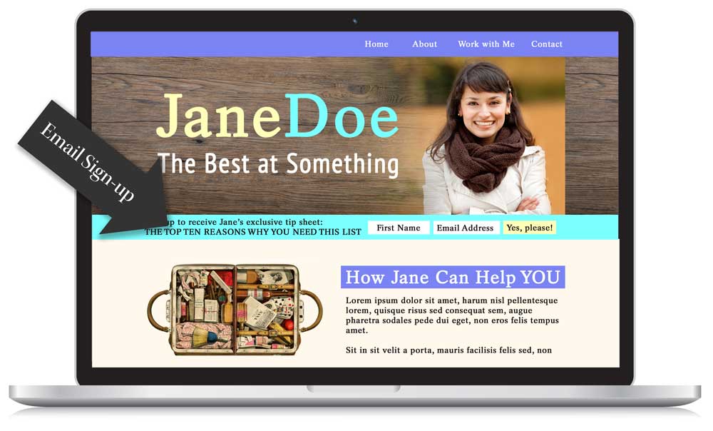
Ok so far. Very typical situation, actually. The horizontal opt-in form (a mailing list sign-up form across the bottom or top of a website header) is in it’s hey-day. When seen on a full-size screen, all is right with the world.
But when viewed on a mobile…
The opt-in text should wrap around and will end up taking up several lines of space on the screen. The header (which should shrink down or otherwise rearrange itself to fit the screen) will end up above or below it, depending on the order of things.
The screenshot at the top of this article shows the the home page of our imaginary site when viewed on a mobile. The email opt-in (a.k.a. sign-up form) is, in fact, taking up almost the entire screen. This is a thing that happens.
So here’s the big question…
What do we see when the user clicks on the menu icon and decides to look at, let’s say, the “About” page?

Um…that looks exactly the same.
What about the Contact page?
Services?
Jane Doe’s Blog?


This is the definition of confusing.
“Did I even go to a new page?”
(Clicks repeatedly on the menu.)
Yes, we know that users scroll now.
The pre-mobile days of **Above the Fold is GOLD** are gone. (Did people say that in, like, 2006? They should have because rhyming.)
For the youths who don’t know what I’m talking about, “above the fold” is a term that originated with printed newspapers and referred to the area of a website that was viewable on a desktop/laptop (the only way people were consuming their internet at the time) before scrolling (because people didn’t necessarily scroll down the page back then).
The top of the page was by far the most valuable area on a website, which is why web pages in the early 2000’s looked totally insane: jam-packed with as much information as possible, no breathing room between objects because the space couldn’t be spared and just generally very different from the web design of today.
Those of use who create websites, whether as a profession or DIY for another type of business, have MUCH more freedom now because our user can be relied upon to scroll down the page and see what else is happening. Glory be!
But that doesn’t mean it’s a good idea to confuse the hell out of them. This shows three different blog posts from the same imaginary website:


Nope. Not okay.*
How does this happen?
On mobile:
An email sign-up form with even slightly long text that wraps around to become several lines on a phone. Add a logo or header image above that and boom…problem.
On mobile:
Sometimes websites have both a sign-up bar at the very top of a web page and another sign-up below the header image. That will pretty much guarantee that this issue will occur.
On laptops, tablets, etc.:
Yes, it happens on larger devices. In this case, if you have a very large (and, yes, it may be absolutely beautiful) header image with an email opt-in form below/above it…oops the entire screen is covered and your user has no idea if they just got to a new page when they clicked on a button in the navigation.
Will they scroll down to find out if they’re on a new page? MAYBE. Will they be confused? YES. Will they find this whole thing annoying? YES. And, to state the obvious, we don’t want to annoy our visitors. They will leave.
Solutions!
1. Very short email opt-in text:
Copy writing is hard enough without throwing THIS in the mix, right? Sorry. But that’s one option. If it only takes up, let’s say, two lines of space on a mobile, you’re in much better shape.
2. Place your opt-in/sign-up form somewhere other than the header:
Options include: a pop-up that works well on mobile (Test it! Some do and some are so annoying that people will leave immediately.) or placing your opt-in somewhere else like the top of the sidebar. It’s all a balancing act: user experience (which is what we’re talking about here) vs PRETTINESS vs conversion rates on your sign-up form vs…probably other things too. But the reality is that no one is signing up for a mailing list before reading SOME kind of content on the site first. If they leave the page before they read anything or are generally annoyed by the experience of visiting the site, they won’t sign up JUST because the opt-in happens to be very visible.
3. Use a different header image on each page:
This can happen through the magic of code or by simply using a theme with this option. So, although your user may not get to see the actual content of a page before scrolling down, they WILL know that they have arrived at a new page because something will look different. Problem solved.
4. A custom solution of some sort:
Basically, remove or resize an element when the site is viewed on small screens. There is code involved as your site will have to do something special based on the width of the screen. This is the freestyle option and also the kind of thing that you’d discuss with your web developer if you have one. So it could be a matter of shrinking down the logo when it appears on a mobile device/small screen, which would leave a bit more room for opt-in text while still letting a bit of content peek through at the bottom of the screen. OR maybe you decide to remove that horizontal opt-in on mobile devices (but leave it on larger ones) and let them sign up using an opt-in in the sidebar/after blog posts once they scroll down further and actually read some content. A good designer/developer can work through a solution that makes sense for the actual layout of your site, typical behavior of your users and your goals.
A final word.
The only way to know if this is an issue on your site is to check. View the site on mobile. Check it out on a tablet or two.
You can use something like this tool to get a very rough idea of the situation on different devices. You can click on the tiny little screens to visit different pages on your site, scroll up and down, etc.
Or get super-fancy about your testing with something like Browserstack. There’s a free trial.
Again, the website visitor of 2015 knows how to scroll. So we just need to see SOME kind of change on the screen that indicates that we’re now on a different page…a visual sign that, yes, clicking on “Blog” actually took us somewhere other than the home page.
Take a look. Is this happening on your site? Have you noticed it on others?
_________________________
*On the other hand…
The fact that every imaginary page looks the same made the graphics for this article infinitely easier. It feels like a fake website screenshot should take two minutes to create, right? Not the case.


Devon Smiley
| 8 January 2015I stopped reading your post half way through…to immediately load my own site on my phone to make sure I wasn’t in trouble. Good news on the top banner…bad news on the banner + pop-up combo.
Hmmmmm….to the drawing board!
Thanks for this info – and the great reminder to double check how our sites will perform across a variety of devices.
curioelectro
| 8 January 2015“I stopped reading your post half way through…” Love that.
Larissa
| 8 January 2015Great post — it’s so easy to forget mobile but SO IMPORTANT. Off to test ours! Thanks!
curioelectro
| 8 January 2015Good luck, Larissa! And a big yes to the importance of mobile. It’s one of those things you can check in Google Analytics: how many people are visiting your site on a mobile and whether they’re leaving faster than your desktop visitors.
Beth
| 8 January 2015Dammit, Nicole! 🙂
My site’s not quite as bad as your example, but it’s pretty close. Thanks for bringing it to my attention. I don’t get many sign-ups, anyway, so maybe just on the sidebar and at the end of my blog posts is sufficient. Food for thought!
curioelectro
| 8 January 2015Dammit, Beth!:) Heat maps are a fun tool if you want to check where people are actually clicking to sign up for your list. That way you can pick a solution that will increase your opt-ins and not hurt you.
There are a bunch of them out there, but I’ve personally tried SumoMe and been happy with it.
Emily
| 8 January 2015Couldn’t agree more about the importance of having great mobile viewing experience! It’s the first way I look at anyone’s new or redesigned sight and it’s always hugely important to me when I work on my own. Thank goodness I have a kick-ass developer/designer whom I trust and know to have the same instincts (shout out to Leah Kalamakis!).
curioelectro
| 8 January 2015Leah is so talented. I just saw the new site she did for Farideh yesterday and it’s gorgeous.
Lauren
| 8 January 2015Never thought about this before! I just had to check my mobile site to make sure that even my logo didn’t do the same thing (luckily it shows some page content under the giant logo, but I still might try to tweak this!).
curioelectro
| 8 January 2015Lauren, your logo is so pretty! And, from what I can see, you don’t have this issue happening at all. But tweaking I do understand…There’s a little change that relates to my own logo/menu that I want to make myself. JUST to bring the content up a bit more:)
Lyn
| 8 January 2015Thanks for the useful post. I just checked out my site on my phone and noticed it looks like what I had been using for mobile optimization (plug in) is not working anymore…
curioelectro
| 8 January 2015Oh, that’s a bummer. Really good that you found out though.
Natalia Real, Website Superhero
| 8 January 2015I totally support this post! Great points 🙂 And I’m partial to solution #4. Will start implementing, thanks for the push!
curioelectro
| 8 January 2015Nice, Natalia!
Silvia
| 29 September 2015This is a great post, Nicole, and I so agree with you.
However, I bumped into it while looking for a solution for the exact opposite 🙂
Do you know by any chance how to stack my nice inline form on mobile? I only use it on the homepage, and I do want it to be very prominent, but that tiny little inline form is useless…
(I’m using the MailChimp for WP plugin.)
curioelectro
| 30 September 2015Hi Silvia–
Love the style of your site. You would need to tweak your CSS—either using a child theme or some other method that would make sure you don’t lose your changes the next time you update your theme.
It’s a matter of going into the CSS and having the width of those form input areas go to 100% once the screen gets as narrow as, let’s say, a tablet. I don’t know your level of experience with CSS, but this is the type of thing that a developer could do VERY quickly if you don’t want to deal with it:) Might be one of those times that hiring out just makes the most sense.
If you ARE familiar with CSS, you would probably add something like this somewhere in the media queries:
.optin-bar input[type=”text”], .optin-bar input[type=”email”], .optin-bar textarea, .optin-bar select {
width: 100%;
}