
Blog Styling Tips for Interior Design Firms [How Good Design Keeps Visitors From Leaving]
 When blog design is good, you don’t even notice it.
You stay focused on the content, hopefully enjoy it and (best case scenario) take some sort of action at the end.
When blog design is bad, you still may not notice it—but you won’t be as engaged or, frankly, as impressed. You may tire out quickly, get distracted by something on or off the page and feel an urge to click away.
Good design is not about bells and whistles. It’s about unsexy things like “readability” and contrast and paragraph length.
It’s about the details. And interior design is a business that revels in the details.
If you have a blog, it can and should be a major outreach tool for your firm.
It’s a chance to not only demonstrate your expertise (through the content itself), but also demonstrate your eye for good design. A great blog post will help you build an interesting brand, answer questions that your competitors aren’t touching and lure potential clients into your sales funnel.
Seriously, why bother investing time and money to create great content if you’re going to dilute its power? Stop losing blog readers halfway through your posts. Use the power of good design to hold their attention.
How does blog styling go wrong?
It’s a built in problem. Maybe you’ve hired an agency to create your visual branding and build your website. And hopefully that website is using a content management system like WordPress, Squarespace, etc. so you can publish your own blog posts. So far, so good.
But, after all of the careful planning that went into each page on the website…blog posts can sometimes feel like an afterthought. And, particularly for an interior design firm, blog post publishing involves more than just typing words.
For one thing, there are always images. What’s the best way to present those? There may be instructions and tips that need to be organized in a helpful way. And how exactly do you lay out your information in a way that keeps those fickle online readers interested for more than three seconds?
It comes down to this: Blog posts need to be designed too. Just like any other web page, they need to be beautiful, legible and up to the same design standards as everything else that you do.
We’ll start with readability because it truly matters. A reader will leave if they don’t like the experience of reading your blog. They may not even know why they’re not having a good time. They’ll just click away.
1. Short Paragraphs
The recommendations for paragraph length on the web have changed over the years, but they can be summed up in one word: “short”. Keep your paragraphs short. If you’re looking for specifics, think 40-55 words or three to five lines.
Of course, the number of lines increases when the content is viewed on a more narrow screen, but that makes this all the more important. No one likes to read long blocks of text online. When in doubt, break it up.
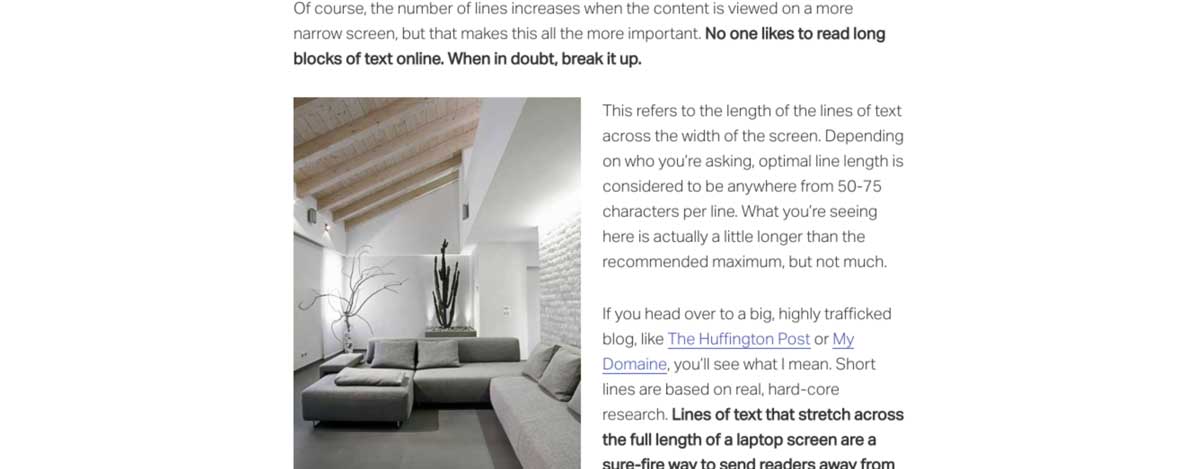
2. Reasonable Line Length
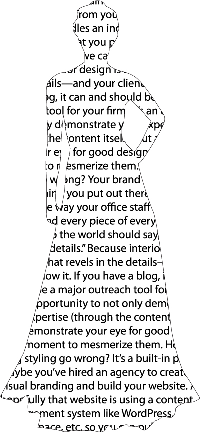
This refers to the length of the lines of text across the width of the screen. Depending on who you’re asking, optimal line length is considered to be anywhere from 50-75 characters per line. What you’re seeing here will depend on the device you’re using, but it’s short enough that it’s not hurting your brain.
If you head over to a big, highly trafficked blog, like The Huffington Post or My Domaine, you’ll see what I mean. Short lines are based on real, hard-core research.
Lines of text that stretch across the full length of a laptop screen are bad for business. You may not realize it, but you’re sending readers away from your blog and on to another one that’s easier to read.
If the lines of your blog are stretching too far across the screen, speak to your web developer about modifying the design.
3. Correct Alignment
I use the word “correct” here because this is not subjective. Here’s some sample text (in the form of a list of cupcake flavors, because that’s where my head is today) for reference:
Left-aligned
Always
Left-aligned text has, as we say in the design biz, a “rag” on the right side. The lines of text all start neatly on the left and end in different places on the right. This is the correct way to format paragraphs of text and, conveniently, the default option on most publishing platforms.
Center-aligned
Never
Center-aligned text has a “rag” on both sides. The problem, from a readability perspective, is that the reader has to search for the start of each new line on the left as they read. They’re all located in different places. Seems like no big deal, but multiply that over twenty or fifty lines of text and you’ve tired out your reader.
This is not to say that you should never center-align any text. Go ahead and center large headings or short blurbs when it fits the design. But never center-align longer paragraphs like the one above.
Full Justified
Never
But look how pretty! Perfect alignment on the left and right sides of the paragraph. This one can be tempting because it feels so tidy when viewed from a distance.
Unfortunately, sacrifices to readability have been made. Full justified alignment creates awkward spacing between words and, sometimes, forced hyphenation from one line to another. Again, you’re tiring out or distracting your reader.
When text is full justified in print publications, designers make manual adjustments to correct the most awkward spacing issues. You don’t have that option (or, honestly, the time to dedicate to it), which makes this a no go for blog posts.
The takeaway? Text in your blog post should be left-aligned.
4. Good Contrast
Is some of your audience in the “aging” category? Then pay special attention to this one. High contrast between the background of the page and the color of the type is key. It’s one of the design basics, but you’ll still see the occasional (and illegible) medium grey type on a mauve background.
Good Contrast
This is text with good contrast between the type and the background. It is easy to read. This is text with good contrast between the type and the background. This is text with good contrast between the type and the background.
Bad Contrast
This is text with bad contrast between the type and the background. It isn’t easy to read. This is text with bad contrast between the type and the background. It isn’t easy to read. This is text with bad contrast between the type and the background.
Good contrast is so important that you can officially check yours to see if it meets the requirements of the Web Content Accessibility Guidelines, which were created in an effort to make web content more accessible to people with disabilities.
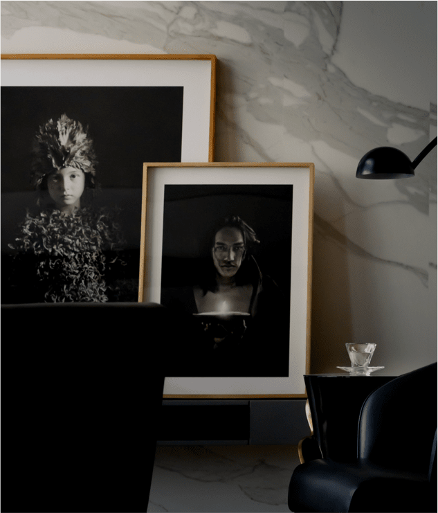
5. Great Use of Images
Now that we’ve limited the width of your blog content area, go ahead and fill that space with images that span the full width of the area. After all, what looks better?
This?
Or this?

We love white space. No, we ADORE white space. But it should always look purposeful. An image floating to the left with random white space on the right doesn’t feel purposeful.
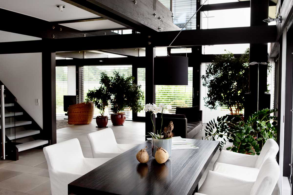
But what about vertical images?
Vertical images should not fill the full width of the content area when viewed on larger devices. We never want a reader on a laptop to have to scroll down the page to see the bottom of an image.
But you’ll still want to consider filling the space by wrapping your text around the image. This type of layout is similar to those that you find in magazines. Like this:
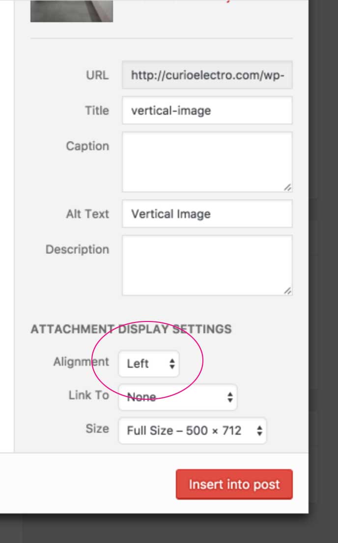 In WordPress, it’s simply a matter of selecting left or right alignment for the image when you’re bringing it into a blog post. “Left” alignment will float the image to the left with the text wrapping around to the right. “Right” alignment will do the opposite.
You also have the option to center your image, which leaves white space on both sides. For more details, check out our full guide to WordPress image settings.
6. Use of Headings
See that? “Use of Headings” is a heading. And this is a smaller heading.
- If you were skimming through this article…you’d know exactly what this section is about.
- If you were a Google bot…you’d know that the keyword “headings” plays a more important role in this article than the tinier words.
- If you were an engaged reader (are you?) who was reading every word…you’d be glad to have a visual break.
Headings are great.
They make a page layout more interesting, help you to optimize the post for search engines and help out the skimmers who want to know which paragraph they should bother reading. There are people who read every single word of your blog post, but they’re probably in the minority.
When you add a heading, you’re inserting a heading tag into the html, but platforms like WordPress allow you to do this without touching the code. Highlight your heading text and look for a pulldown like this:
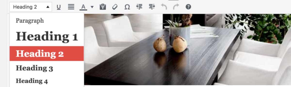
A few guidelines…
The style of your headings (how big are they? what font?) is set by the theme you’ve chosen or had customized. This is great for consistency. Just keep the following in mind:
- Heading 1 is usually generated automatically on the page. It’s the big page title. Because you should only have one <h1> tag on a page, you should skip this one. Don’t use Heading 1 in your content.
- Heading 2 is your best friend. It tells search engines that those words are important.
- Heading 3 is a bit smaller and less important, which makes it great for sub-headings on longer, more robust articles.
If you do have to dig into your html (otherwise known as “Text” mode in WordPress), you’ll place an opening tag at the beginning of your heading and a closing one at the end. Like this:
<h2>This is a heading.</h2>
Please consider using headings. There are too many good reasons.
The purpose of a well-designed blog post is to keep them reading.
Know your audience. Have a strategy for your blog content. But be aware that even the most stellar content is pulled down by bad readability and poor layout.
Bad design will take them out of the moment. Great, well-designed content will demonstrate your expertise, keep your target client reading and show them that you have an eye for detail.
So…are you doing some of these things already? Is any of it going on your to-do list? Let me know in the comments.


Becky Harmon
| 15 January 2017Great article.
curioelectro
| 16 January 2017Thank you, Becky!
Terri
| 16 January 2017Great content Nicole.
curioelectro
| 17 January 2017Thank you so much, Terri:)
Sandra Funk
| 16 January 2017I’m a believer! Thanks Nicole!!
curioelectro
| 17 January 2017Haha! Nice.
Debi Pinelli
| 22 January 2017Very helpful article. It confirmed some things that I always do, but didn’t know there was a reason for it. I didn’t know about line length…I’ll need to check that on future posts. Thanks!
curioelectro
| 23 January 2017So glad you found it helpful, Debi:)
Remya Warrior
| 17 February 2017Great article, Nicole. Well thought, interesting & helpful.
Mazuryk Vermeulen
| 13 September 2017Thank you, I have learned a lot!
Theresa
| 16 March 2023LOVE this article! Notes written, points taken 😉 Now off to write some blogs….
Nicole Heymer
| 16 March 2023Yeah, Theresa! Go get ’em!:)
VividKreations
| 25 April 2024What an inspiring read! Your tips on interior styling are practical and easy to follow. I can’t wait to implement some of these ideas in my own space!