10 Places to NOT Be Creative on Your Website [And the Reasons Why]
Creative people are the best.
Business owners, interior designers, designers of any type…we just want to express ourselves. And when it comes to branding, creativity is everything. It’s what removes the bland from our business, makes a service memorable and separates us from our competition.
Creativity is great. Except when it isn’t.
Long ago (but really not that long ago at all), there was a time when websites were a brand new thing. People had to decide how they would be structured. So standards were created: what a website generally looks like, how we get from one part of a site to another, how we know we can trust the source of the information, etc.
These standards evolve as the years pass. And it’s not that these things MUST be this way—but that we’ve been trained to expect them. You know what’s great about that? Your website users don’t need to spend time learning a new system when they get to your website. They can just jump in and start learning about your service.
This article is about how to get out of your own way. Let the potential client understand your services, fall in love with your brand and eventually hire you. Be creative when you should and stay deeply uncreative in the following areas.
Don’t get creative with…
1. Stating What You Do
What’s the most common way that people describe what your company does? Say it like that. If you’re an interior designer, say that. If you’re an architecture firm, say that. Don’t make them guess. Don’t come up with creative ways to state it or leave out the words in favor of just an image showing your work. It’s not enough. State what you do.
Don’t worry. There’s plenty of room for creativity in other areas of your website copy.
2. Words in the Top Navigation Menu
I can actually distill ALL advice for the navigation at the top of your website down to four words: Don’t get cute here.
Don’t say “Connect!” instead of “Contact”. Don’t say “Love” instead of “Testimonials”. Use the word “Blog” instead of something unique and branded. If this advice is making you sad, let me comfort you by providing an exception to the rule. If your blog gets so damn famous that people understand what “Stylish Notes” means—without having to pause and think—then by all means, use it.
The point of a top navigation isn’t to surprise and delight. It’s to provide a path to the things that actually surprise and delight. Its whole mission is to not be confusing, which is why we stick with the most standard wording—like “about”, “portfolio”, “services”, “testimonials” and “contact”. People know what these things mean. They serve their purpose so we can move on with important job of selling your services.
3. New Fonts
Your visual brand—from color palette to your chosen fonts to your logo design to your use of photography—should be creative and memorable and unique. But there is one thing that every great visual brand has in common: rock solid consistency.
No one will remember your brand without consistency. Your website should remind me of your business cards. Your print ads should remind me of your website. If you have an established visual brand, don’t get creative with your fonts when it comes time to design your website. Keep your branding consistent.
(On the other hand, if you don’t have an established visual brand, the planning phase of a website design is a great time to build one.
4. Random Colors
See above. Choose a color palette for your brand and use it. Don’t suddenly get creative with the colors when it comes time to build a new website—unless you’re rebranding.
Use your chosen color palette. Become recognizable through the use of gorgeous, juicy consistency.
5. Position of the Top Navigation Menu
Just put it across the top of the page. Website visitors look for it in this spot. It doesn’t get in the way of your content.
I know you can show me exceptions to this, particularly down the left side of the screen. (This was where all navigation menus went in the 90’s. Choker necklaces and other 90’s fashion staples have been back for awhile now, so let’s call it vintage.)
By all means, ignore this advice if your design benefits from a different solution. But really—just place the navigation across the top of the page. Why mess with what works?
6. Animation
Once again, let’s journey back to the beginnings of the internet…when “splash pages” provided a moment of forced “entertainment” before the user was allowed to click the “enter here” button and get to the meat of the website. (Of course, at that point, you were mostly just told “Welcome to our website!”. The real content may have required another click.)
In general, there was a lot of terrifying animation occurring back then.
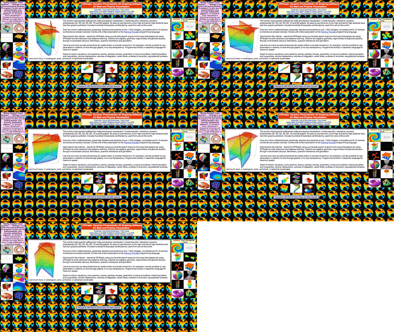
Sure, it’s fun to mock 90’s web design. (Also, one day it will be fun to mock 2017 web design. Probably when everything is communicated by telepathy or whatever.) But the real message here is not that animation is bad. It’s actually very powerful.
Animation and movement are amazing tools for drawing attention. They must be treated with respect.
I had a potential client, not too long ago, ask me to create an introductory splash page with a smoke animation for an interior design website. She was putting creativity above function.
Animation and movement will grab your user’s eye and never let go. They should be used sparingly and with purpose. Examples include: to indicate a link when the user hovers over something, to clearly show a change from one portfolio image to another, to signal that something is loading, to provide a moment of on-brand delight, to demonstrate something important or to draw attention to an important call to action.
For this one, feel free to get creative but, more importantly, stay strategic. If something moves, it better be for a good reason.
7. Sound
To state the obvious: Never, ever have music start playing on your website without your user’s permission. But you already knew that.
8. Size and Prominence of the Logo
Visit any major brand’s website and you’ll notice that all of the logos are similar in this way: they are not huge. A logo should be visible, nicely contrasted against the background of the page and large enough to be legible—but it shouldn’t take up half the height of the screen. There’s just no benefit to that.
You know what should be bigger or more eye-catching than your logo? Images that explain what you do, words that explain what you do/why it is unique and buttons that lead the user where you want them to go. All of these things help your user and help your business.
Keep your logo visible and clear, but don’t make it the most prominent part of the design.
9. Styling of Body Copy
Body copy (this is body copy—the smaller words on the page) has one main job—to be legible. The font choice should be strategically plain and readable at small sizes. The background should provide enough contrast against the type that the letters don’t vibrate (think red type on green background) or fade away (think medium grey type on light grey background).
Have you ever tried to read a whole web page or brochure written in a decorative font? Yikes. Someone got creative.
Instead, get creative with the font choice on your large headings. Those are a perfect place to add flavor to your visual brand. (But, again, only with rock solid consistency.)
10. Explaining the Benefits
Do your services help someone with something? Of course they do. (If the answer is no, it’s time for a larger conversation.)
There’s no need to keep that a mystery. Talk to your clients, ask them why they hired you instead of a competitor, ask them about their favorite part of working with you…and put that information out into the world.
Don’t get creative with flowery adjectives describing your services. Give website visitors the nitty gritty. Provide the hard facts. Show them testimonials. Provide numbers when you can. Tell real stories.
A business website is not an art project.*
It’s a tool to educate, communicate, sell things, create a sense of community, entertain or whatever else. The purpose determines the functionality. Use best practices to give your website visitor a great experience. And then get creative where it counts.
*Someone please go back in time to tell me that in 2010. Our very first website was all about unnecessary animation.

